Color has a remarkable ability to shift your mood. When the world outside feels gray and ordinary, the right palette can transport you somewhere warm — to a beach, a jungle, a sunset over clear water. These 11 tropical color combinations are designed to do exactly that. Each one captures a different flavor of warm-weather color, from punchy pineapple brights to soft, dreamy coastal blues.
Use them as a starting point, a reference, or a challenge. Pick one that matches your mood today and see what your coloring pages look like through a tropical lens.
Each palette below includes approximate hex codes to help you find matching pencil equivalents, digital colors, or marker shades.
1. Pineapple Pulchritude
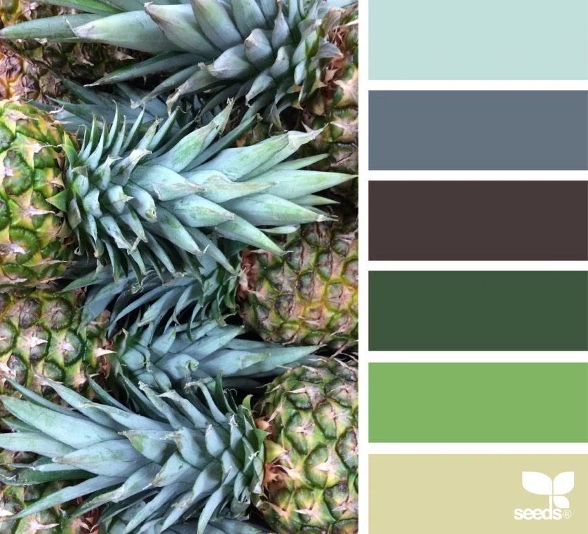
Bright greens mixed with cool blues make this palette feel fresh and playful. It's bold without being overwhelming and works beautifully on patterns, geometric pages, and tropical fruit designs. If you're coloring anything with leaves, repeating shapes, or botanical motifs, this one shines. Think jungle floors, lush canopies, and that first sip of something cold and green.
#5CB85C · #B5D333 · #2EA3DB · #00B4D8 · #90E0EF
2. Calming Coast
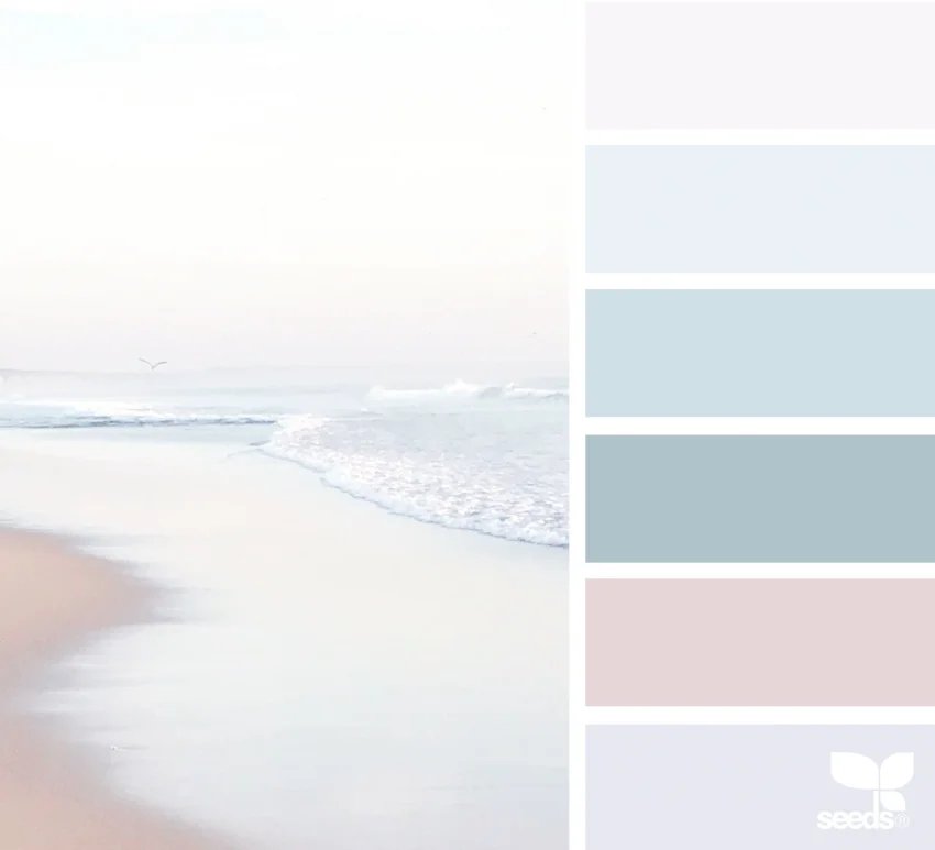
Soft blues, pale purples, and gentle pinks instantly feel like a quiet beach morning before the crowds arrive. This palette is perfect for mandalas or slow, relaxing coloring sessions when you want to unwind and keep things peaceful. It pairs especially well with floral and abstract designs where subtle transitions make the page breathe.
#B8D8E8 · #D4B8E0 · #F5C2CB · #E8D5F0 · #B0C8D8
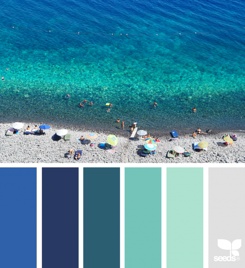
3. Teal Waters
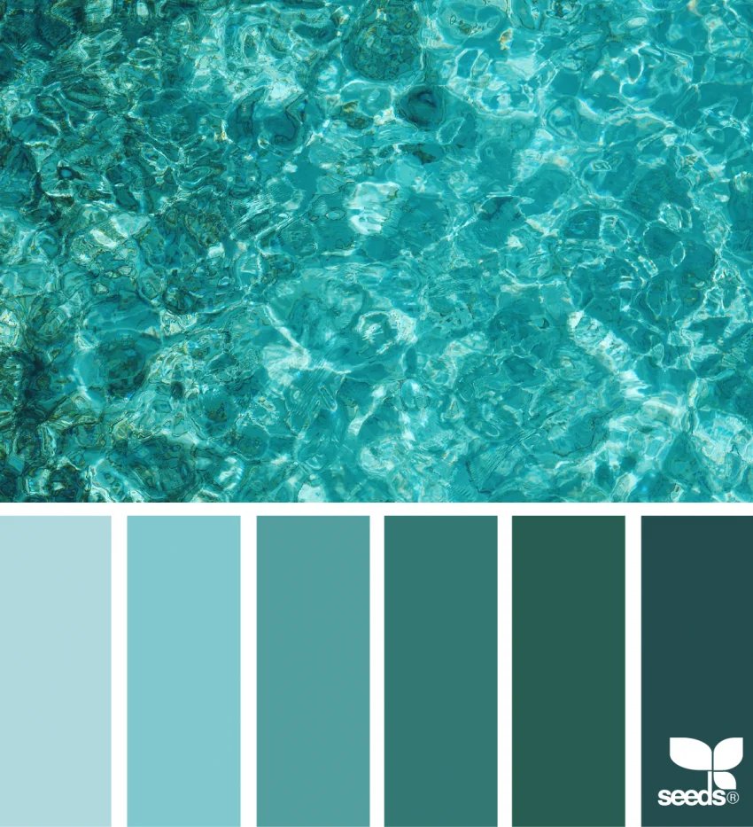
Teal in all its shades feels like the ocean on a perfect day. From light blue-green to deeper turquoise, this palette is ideal for sea life, wave patterns, and beach-themed coloring pages. It's soothing but still full of life — great for colorists who love cool tones but want something more layered than a single blue.
#A8E6CF · #4CC9B0 · #2A9D8F · #1D7A72 · #115E58
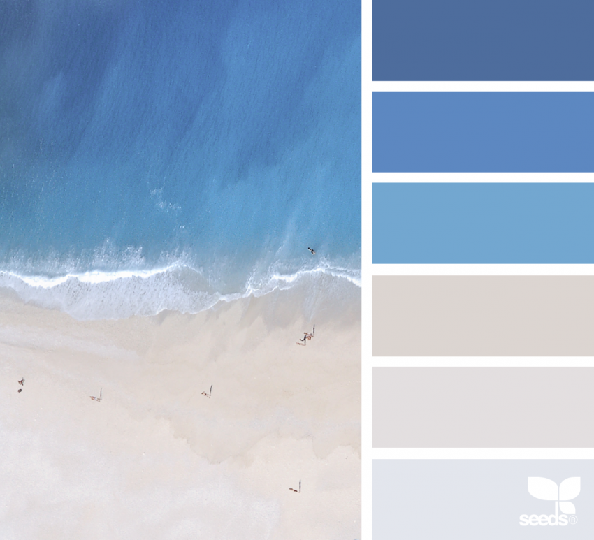
4. Perfectly Pristine
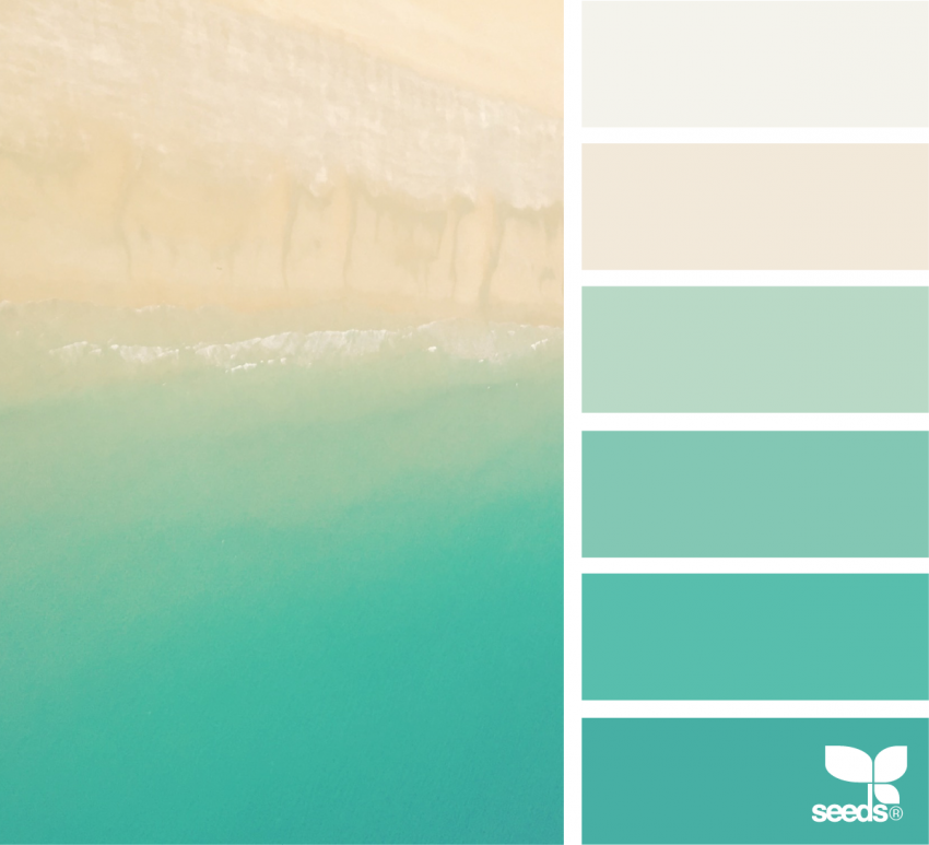
This palette fades from sandy neutrals into deep aqua tones, creating a clean, balanced look that feels both fresh and grounded. It's a great choice if you prefer subtle transitions and smooth blending without super bright colors. Think of it as the resort palette — understated luxury with a tropical edge. Beautiful on architectural designs and nature scenes alike.
#F5ECD7 · #DDD0A8 · #A8D8D4 · #4BBFB5 · #1A8E87
5. Sunset Bloom
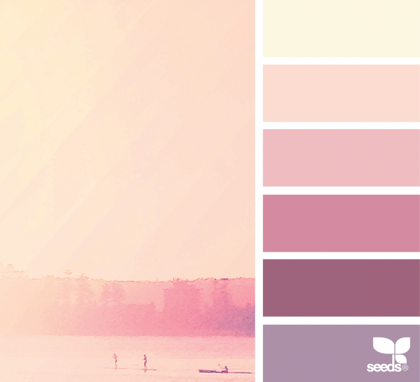
Peach, pink, and soft purple capture those magical moments when the sky changes color just after the sun dips below the horizon. This palette works beautifully for flowers, tropical skies, and any nature scene where you want warmth and emotion without intensity. Layer these tones from light to deep for soft gradient effects that practically glow.
#FFCBA4 · #FF9D7E · #F07CA0 · #C47AC0 · #8B5B9E
6. Crystal Cove
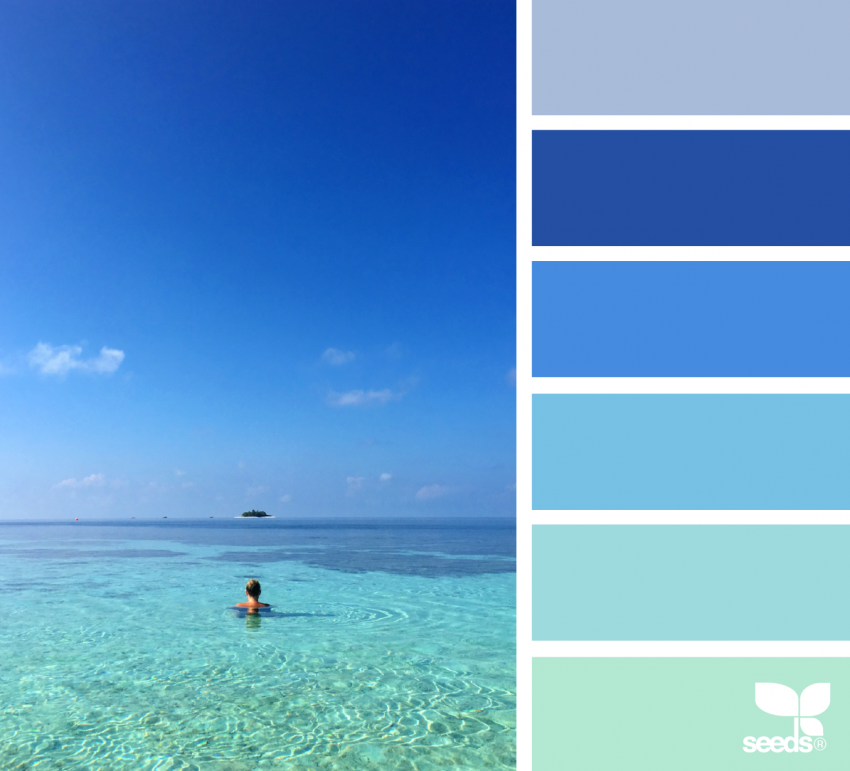
Clear blues and turquoise tones make this palette feel like floating in crystal-clear water over white sand. It's perfect for ocean scenes, underwater designs, and any coloring page where you want that fresh, breezy island vibe. Use darker turquoise for depth and lighter sky blues for the shallower areas — the contrast creates a beautiful sense of dimension.
#E0F4FF · #8ED8F8 · #38BEED · #00A3CC · #00BFCF
7. Island Escape
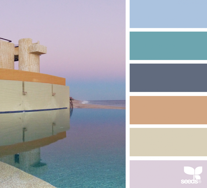
This palette mixes sunset pinks, calm blues, and earthy neutrals into something that feels relaxed but lively at the same time. Use it on architecture, travel-themed pages, or scenes with buildings and landscapes. The neutral anchor tones keep the brighter shades from overwhelming each other — a great palette for colorists who want warmth without going all the way tropical.
#F4A460 · #E88C8C · #7BB8D4 · #A4C2A5 · #D4C5A9
8. Poolside Party
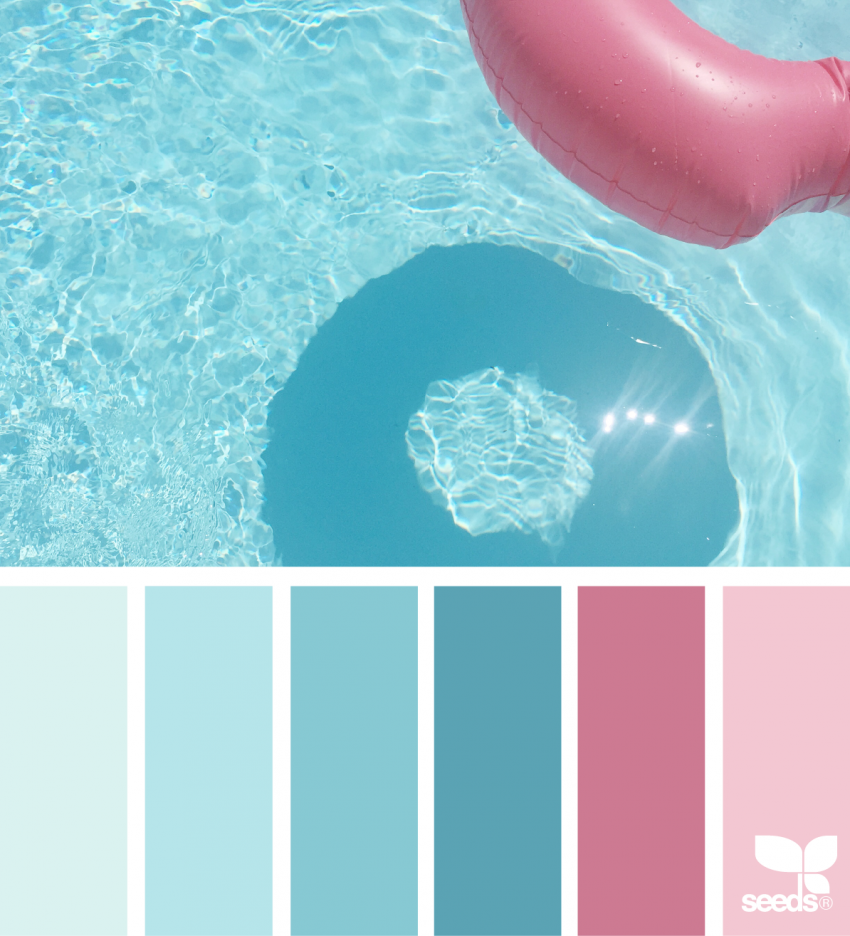
Bright pinks and blues bring poolside energy to life. This palette feels playful and fun, making it a great choice for whimsical designs, summer scenes, and lighthearted coloring pages. It's the palette you reach for when you want your finished piece to feel happy and unapologetically colorful. Great with gel pen metallic or glitter accents on top.
#FF6B9D · #FF85B5 · #45B8F5 · #00C8E0 · #FFD166
9. Palm & Pink
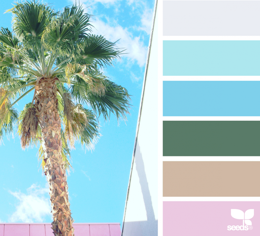
Palm trees and pink skies are a classic tropical combination. This palette feels cheerful and retro, perfect for desert scenes, tropical florals, and anything inspired by warm-weather getaways. The contrast between the warm pinks and the cooler greens gives designs a vibrant, eye-catching quality. Try this on botanical or nature-themed pages for a fresh twist.
#4A8C3F · #78B840 · #A8D458 · #F5A0B5 · #E8C4D0
10. Deep Seas
Rich blues paired with soft sandy tones create a dramatic but calming palette that feels like looking down into deep water from above. It's ideal for underwater scenes, ocean patterns, and any design where you want depth and contrast. The sandy tones serve as a beautiful counterpoint to the blues — use them for seafloor, coral, or light-catching highlights.
#0C2D7C · #1565C0 · #2196F3 · #D4C4A0 · #C4B090
11. Coastal Dream
Soft blues, stone neutrals, and muted coastal tones make this palette feel timeless and dreamy. It's perfect for seaside towns, travel-inspired pages, or detailed illustrations where you want a relaxed, elegant look. This is the palette for slow Sunday coloring — thoughtful and unhurried, with colors that reward careful blending.
#B0C8D8 · #A8B8C0 · #C8D0D4 · #8898A4 · #D8E0E4
How to Use These Palettes in Your Coloring
Tropical palettes work across all media. With colored pencils, layer light tones first and deepen gradually — tropical colors gain richness with each layer. With alcohol markers, work wet-on-wet for seamless blends between adjacent colors. And don't underestimate gel pen accents — a touch of gold or white sparkle on water or tropical foliage lifts the whole piece.
If you're not sure which tool is right for your project, our guide to choosing the right coloring tool breaks down exactly when to reach for each medium. And when you're ready to start, browse our free printable coloring pages — floral, botanical, and mandala designs all work beautifully with tropical palettes.
You don't need a plane ticket to feel a little sunshine. Sometimes all it takes is the right mix of colors.
Frequently Asked Questions
What colors are considered tropical?
Tropical colors typically include bright jungle and lime greens, ocean blues and teals, coral orange, hot pink, golden yellow, and warm sandy neutrals. Think of the palette at a sun-drenched beach — vivid, warm, and saturated. Softer variations of the same hues — muted teals, dusty pinks, stone neutrals — give a more relaxed "coastal" feel without the full tropical intensity.
What is the best tropical color combination?
There's no single answer — it depends on the mood you want. For vibrant and bold, try pairing coral orange with electric teal and lime green. For soft and beachy, muted turquoise with sand and blush pink works beautifully. For dramatic depth, deep navy with sandy neutrals and a pop of bright aqua. Each palette above targets a different feel, so browse by mood rather than a fixed formula.
How do I match hex codes to coloring pencils or markers?
Search the hex code on sites like color-name.com to get the closest named color and find matching pencil or marker shades by brand. Many manufacturers (Copic, Prismacolor, Faber-Castell) publish color charts with comparable swatches. For digital coloring apps, hex codes work directly — paste them into the color picker to get an exact match.
What coloring tools work best with tropical palettes?
Alcohol markers blend tropical colors beautifully — the wet-on-wet technique creates seamless gradients between adjacent hues. Colored pencils reward patient layering: start light and build to full saturation over several passes. Gel pen white or metallic accents add sparkle to ocean surfaces, flower highlights, and foliage. Most tropical palettes work well with any medium — choose based on the effect you want, not the palette itself.
Can I mix colors from different palettes?
Absolutely — these palettes are starting points, not rules. Mixing the ocean blues from Teal Waters with the floral pinks from Sunset Bloom creates a Hawaiian-inspired scheme that feels both tropical and romantic. The Poolside Party brights pair naturally with Palm & Pink greens. Treat each palette as a suggestion and trust your instincts when something feels right together.