As the holiday season approaches, one of the best ways to embrace the festive spirit is to settle in with coloring pages and a carefully curated color palette. Christmas coloring offers a mindful escape from holiday stress while keeping your hands and mind engaged in something meaningful and beautiful. Whether you're drawn to traditional reds and greens or prefer soft modern neutrals, the right color palette can transform your coloring experience and bring your pages to life with seasonal magic.
Below, we've gathered 12 Christmas color palettes that span the full spectrum of holiday aesthetics—from deep forest greens and rich burgundies to soft pastels and snowy whites. Each palette tells its own story and pairs perfectly with specific page types. Mix and match these combinations, combine them with metallic accents, or use them as inspiration for your own unique Christmas color journey.
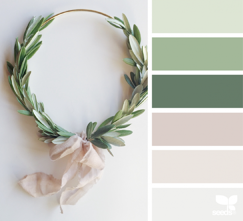
1. Wreath Ready
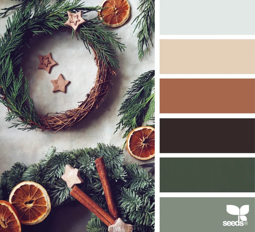
Burnt sienna, forest green, and deep brown create a naturally warm and earthy foundation that feels like late autumn melting into early winter. This palette captures the essence of traditional wreaths, harvest-inspired arrangements, and botanical holiday designs. Use the burnt sienna for flowers, berries, and accents; the forest green for foliage, pine branches, and leaf details; and the deep brown for stems, shadows, and grounding elements. This combination works beautifully on pages featuring floral wreaths, garland designs, and nature-inspired holiday illustrations. The warmth of the sienna against cool forest green creates a balanced, sophisticated look that's both traditional and timeless.
2. Snowy Summit
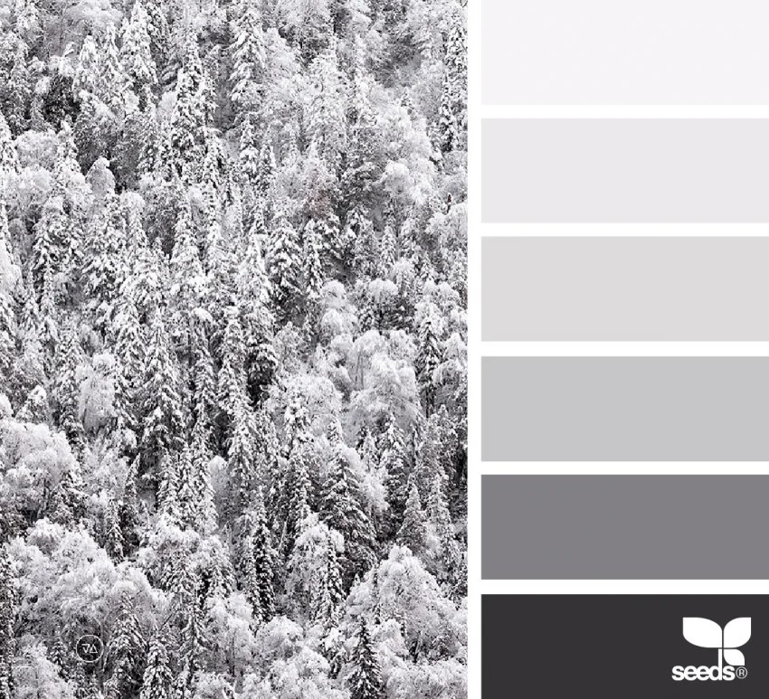
Soft whites, cool grays, pops of traditional red and green—this is the palette of pristine winter landscapes and freshly fallen snow. Snowy Summit brings a clean, festive, and timeless aesthetic that appeals to lovers of minimalist holiday design. Use whites and pale grays as your base for winter scenes, then strategically place bright red and green accents as visual interest points—think red cardinals against gray branches, or green pine trees dusted with white snow. This palette is perfect for snowflake patterns, winter village scenes, and frost-covered landscapes. The cool undertones give everything a crisp, fresh feeling that's energizing rather than heavy, making it ideal for anyone who finds traditional dark Christmas palettes too intense.
3. Holiday Succulents
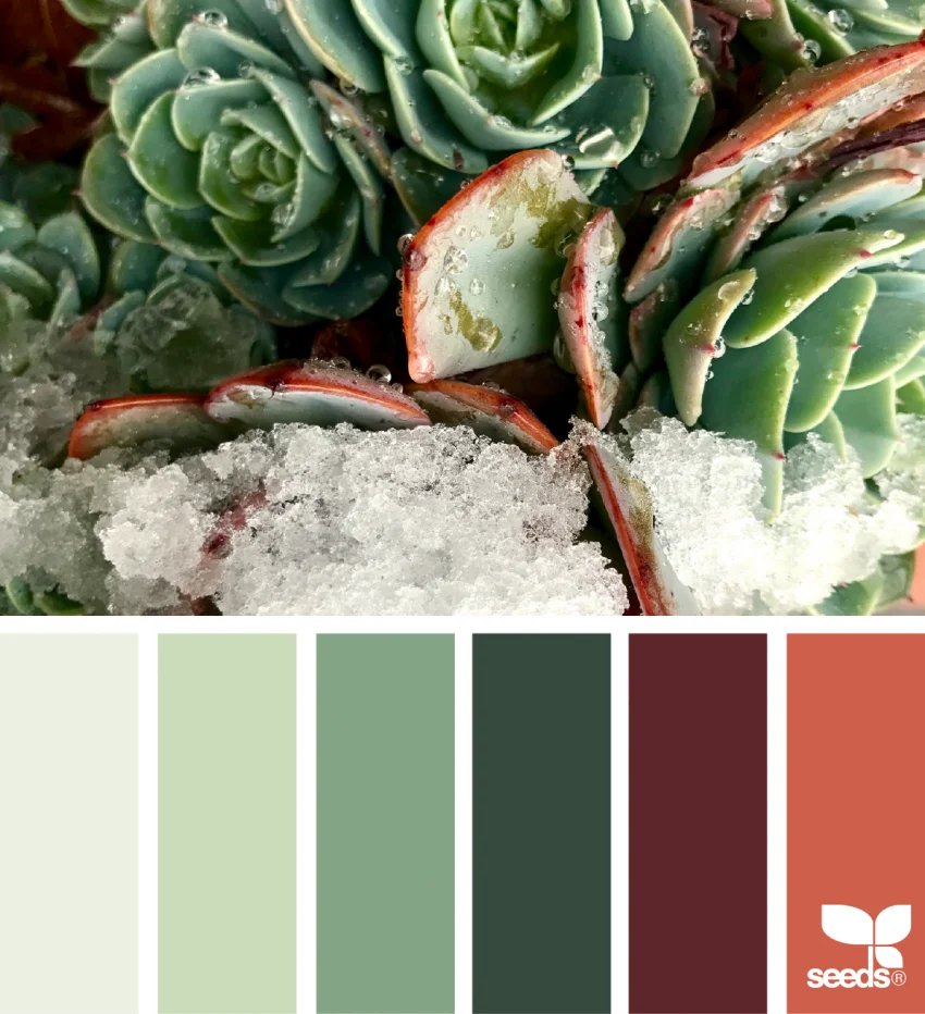
Blush reds paired with strong, vibrant greens bring a fresh and modern Christmas energy to any coloring page. This palette celebrates the contemporary holiday aesthetic—moving away from heavy traditional colors into something lighter, more playful, and unexpectedly charming. Blush reds work wonderfully for flowers, berries, and delicate floral elements, while strong greens anchor the design and provide bold contrast. This combination shines on pages featuring botanical arrangements, modern floral designs, succulent illustrations, and poinsettia variations. The softness of the blush against the vibrancy of the green creates a design that feels both sophisticated and approachable, perfect for those who love plants and want their Christmas coloring to reflect modern aesthetic sensibilities.
4. Cheerful Ornaments
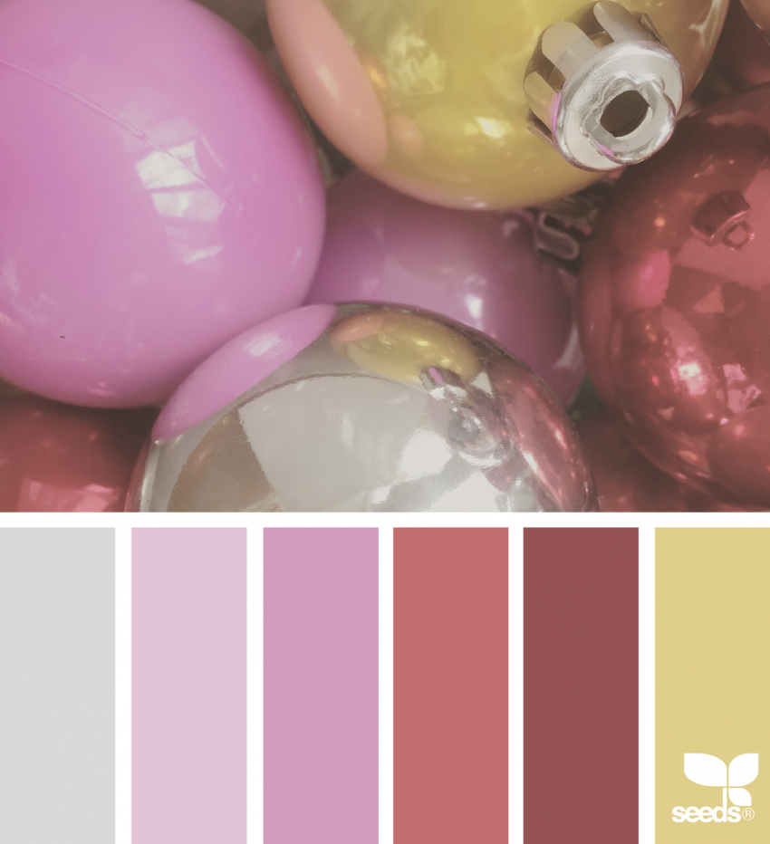
Bright pinks and golden yellows combine to create an undeniably joyful and playful Christmas palette. This is the color story of childhood wonder, twinkling lights, and the pure delight of the holiday season. These bold, saturated hues work spectacularly on ornament designs, decorative baubles, holiday patterns, and festive illustrations. The brightness of hot pink against warm golden yellow creates visual pop without feeling chaotic—these colors are designed to be used generously and with confidence. This palette is perfect for anyone who wants their coloring pages to radiate happiness and energy. Use the bright pink for ornament bodies, flower centers, and decorative details, and the golden yellow for highlights, reflections on glass ornaments, and surrounding pattern work. This combination especially suits mandalas, pattern-heavy designs, and geometric holiday illustrations.
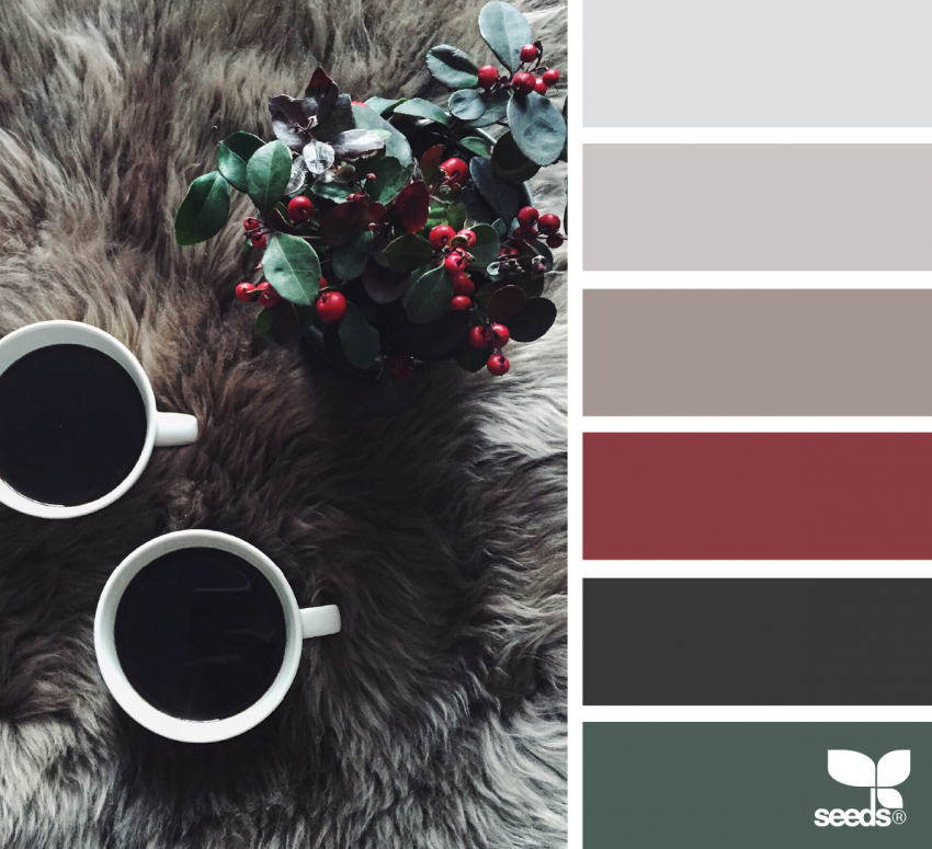
5. Festive Decorations
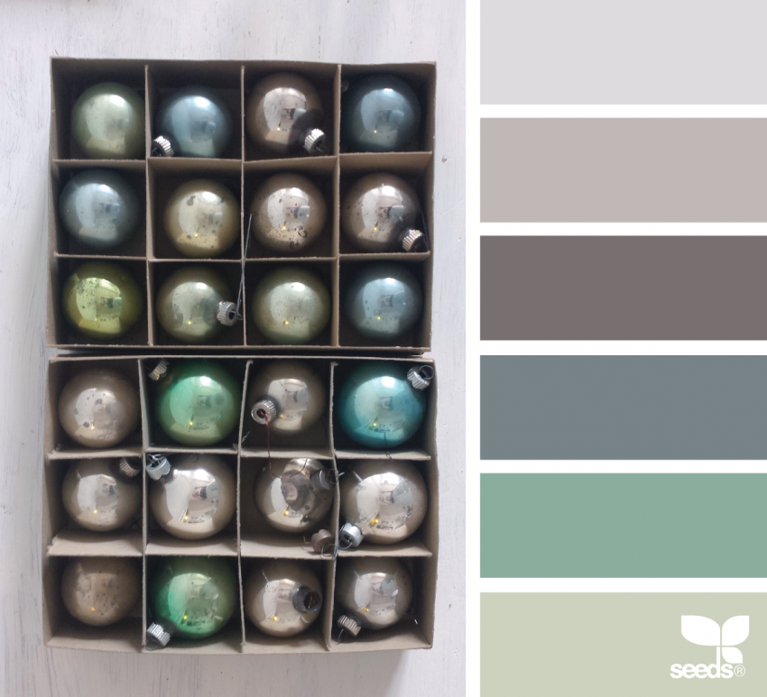
Cool grays mixed with soft greens evoke the vintage holiday aesthetic—that nostalgic, elegant feeling of classic Christmas imagery from decades past. This palette is sophisticated without being cold, festive without being loud. It works exceptionally well on pages featuring vintage holiday decorations, old-fashioned ornaments, and retro-inspired Christmas designs. The cool gray provides structure and elegance, while soft green offers warmth and life. Together they create a muted, refined look that feels both timeless and current. Use the gray for backgrounds, shading, and sophisticated decorative work, and the soft green for foliage, accents, and color emphasis. This palette pairs well with detailed line work, ornate patterns, and pages that benefit from a calm, contemplative coloring experience.
6. Poinsettia Classic
Deep reds paired with silvery green and touches of dark brown or near-black create a bold, traditional, and unmistakably elegant palette for one of Christmas's most iconic flowers. This combination captures the drama and beauty of poinsettia arrangements—those perfect holiday plants that demand attention and admiration. The deep red is saturated and rich, perfect for petals and flower centers where you want maximum impact. Silvery green provides a sophisticated foil that keeps the intensity from becoming overwhelming, while the dark brown or black adds definition, shadow, and grounding contrast. This palette is specifically designed for pages featuring poinsettia arrangements, bold floral designs, and traditional Christmas florals. The combination of deep, rich colors creates a look that feels premium and carefully considered—perfect for anyone who loves color intensity and traditional beauty.
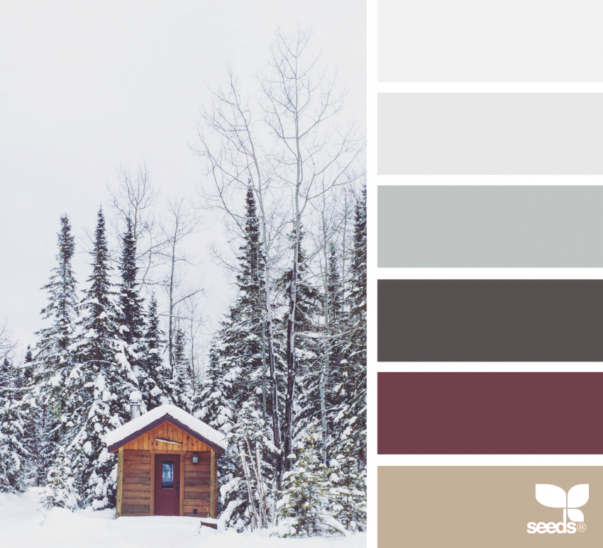
7. Winter Neutrals
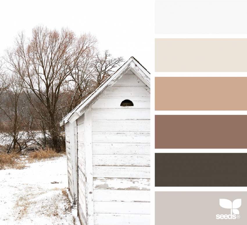
Pale gray, bark brown, soft cream, and gentle greens work together to capture the quiet beauty of winter landscapes and the natural aesthetic of snowy, frost-covered scenery. This palette is for those who find bold Christmas colors overwhelming and prefer the understated elegance of nature. Winter Neutrals works beautifully on pages featuring bare trees, winter forests, rustic scenes, country cottages, and snow-laden landscapes. The neutral foundation allows you to focus on line work, detail, and shading techniques without the distraction of intense color. Use pale gray for skies and distant elements, bark brown for tree trunks and structure, soft cream for highlights and snow, and gentle green for evergreen trees and subtle foliage. This palette creates a cohesive, sophisticated look that feels calming and meditative—perfect for a slower, more contemplative coloring session.
8. Holiday Hearth
Balanced red and green softened with tan and gray create the quintessential "cozy Christmas" palette—familiar, warm, welcoming, and reliably beautiful. This is the color combination of traditional holiday imagery, the one that works for almost any Christmas design and never fails. Holiday Hearth is an all-purpose palette perfect for fireplace scenes, indoor holiday settings, family gathering illustrations, and general Christmas coloring pages. The red and green provide that essential Christmas spirit, while the tan and gray soften the intensity and prevent the design from feeling too bold or overstated. This palette is forgiving and versatile—you can emphasize red for some elements, green for others, and use tan and gray as bridges and transitions. It's the reliable choice for anyone who wants to create beautiful, balanced holiday coloring without overthinking color choices.
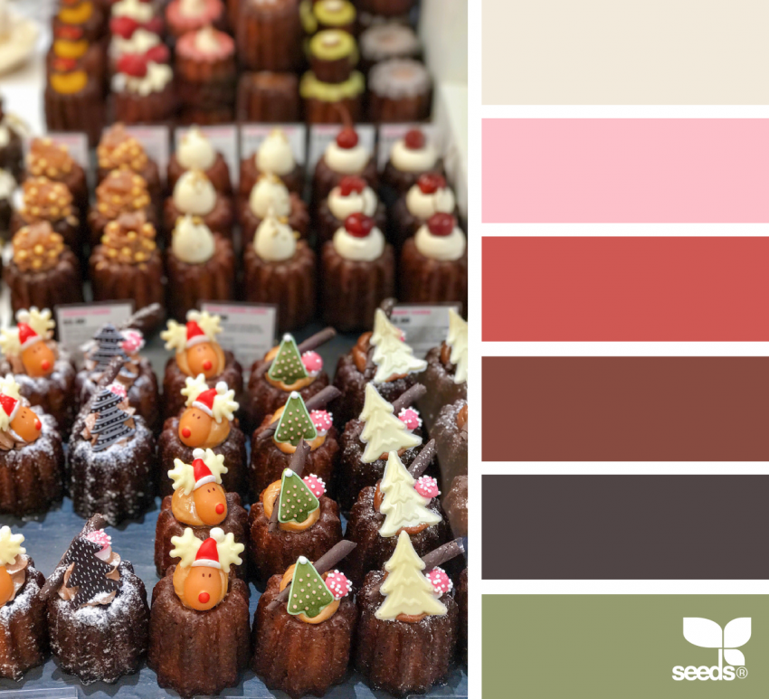
9. Holiday Treats & Sweets
Pink, chestnut brown, olive green, and soft neutrals combine to create a playful, whimsical palette inspired by holiday candy, sweets, and festive treats. This is the color story of gingerbread houses, candy canes, holiday baking, and all the delicious traditions of the season. The pink brings sweetness and joy, the chestnut brown grounds the design and suggests chocolate and spice, the olive green adds an unexpected sophisticated touch, and soft neutrals tie everything together. This palette works wonderfully on pages featuring candy illustrations, baking scenes, gingerbread houses, and festive dessert designs. It's playful without being childish, sophisticated without being stuffy. The combination creates visual interest and tells a story of holiday indulgence and celebration, making it perfect for anyone who wants their coloring pages to feel festive, fun, and a little bit delicious.
10. Pure Christmas Hues
Soft greens paired with warm beige create a minimalist, calm, and classy Christmas aesthetic that feels refined and intentional. This palette strips away unnecessary complexity and focuses on the essential beauty of two colors working in harmony. Pure Christmas Hues works beautifully on home-themed designs, interior decoration illustrations, and elegant holiday patterns. The soft green suggests evergreen trees and foliage without demanding attention, while warm beige provides a neutral, calming foundation that makes the green feel even more special. This palette is perfect for meditative coloring—there's no color competition, no need to make difficult choices about which element gets which color. Instead, you can focus on technique, shading, and the satisfaction of watching two complementary colors create something greater than the sum of their parts. It's sophisticated, restful, and deeply satisfying.
11. Winter Wonderland
Deep forest greens, crisp whites, and bold red accents create a palette full of Christmas storybook magic and illustrated wonder. This combination captures the feeling of classic Christmas stories—the richness, the drama, the sense of possibility and adventure. Winter Wonderland works spectacularly on pages with patterns, decorated designs, and illustrations that benefit from bold color contrast. The deep forest green provides a strong, elegant foundation, crisp white creates bright, clean areas and highlights, and the bold red accent draws the eye and creates visual interest. Use this palette generously on patterned designs, decorative illustrations, and pages where you want strong color presence. The result is a look that feels storybook-perfect—the kind of coloring that makes you feel like you're illustrating a beloved children's tale with professional skill.
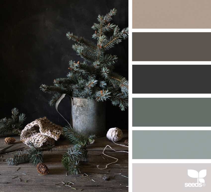
12. Seasonal Pine Trees
Muted greens, soft grays, and gentle neutrals work together to create a moody, peaceful, and sophisticated palette inspired by winter forests and evergreen landscapes. This is the palette for anyone who loves nature, appreciates subtle color work, and wants their Christmas coloring to feel calm and contemplative rather than bright and energetic. Seasonal Pine Trees works beautifully on forest scenes, landscape illustrations, and pages featuring trees, mountains, and natural winter scenery. The muted greens feel authentic and peaceful, the soft grays add depth and atmosphere, and gentle neutrals create transitions and shadows. This palette creates a cohesive, sophisticated look that feels like stepping into a winter landscape. It's perfect for slower, more meditative coloring sessions where the goal is relaxation and mindfulness rather than bright visual impact.
How to Use Christmas Color Palettes
Now that you've explored these twelve beautiful palettes, here are some ways to use them in your coloring practice:
Mix and Match: Don't feel limited to using a single palette on one page. Many Christmas pages benefit from combining elements of two or three palettes. For example, you might use Holiday Hearth as your base palette but pull in an accent color from Cheerful Ornaments. This creates personalized, unique results while still maintaining color harmony.
Add Metallic Accents: Christmas is the season for shimmer and shine. Take any of these palettes and elevate them by adding metallic gel pens—gold, silver, or copper—for highlights, details, and special accents. Sakura Gelly Roll Metallic pens and the Color Technik metallic set are both excellent choices for adding seasonal sparkle. A simple page becomes magical when you add a touch of shine to ornaments, star points, or decorative details. Check out our complete guide to gel pen art techniques for inspiration on how to use these shimmering tools effectively.
Deepen Your Technique: Use these palettes as an opportunity to practice blending and layering. Once you've chosen your palette, experiment with blending colored pencils to create smooth transitions between palette colors. Prismacolor Premier colored pencils are a favorite for their soft, blendable cores. Or try layering markers and colored pencils to add depth and dimension—Ohuhu alcohol markers pair beautifully with colored pencils for layered holiday scenes.
Create a Series: Choose one palette and use it for multiple coloring pages. This creates visual cohesion and helps you deepen your understanding of how colors work together. By the end of a coloring session with the same palette, you'll have developed an intuitive understanding of that color combination.
Explore our full collection of Christmas coloring pages and choose designs that appeal to your chosen palette. Whether you prefer botanical wreaths, festive patterns, holiday scenes, or intricate mandalas, you'll find pages that bring out the best in your selected colors.
The most important thing to remember about Christmas color palettes is that they're tools for inspiration, not strict rules. Use them as starting points for your creative exploration, adapt them to your preferences, and most importantly, enjoy the process of coloring. Whether you choose a bold palette like Cheerful Ornaments or a subtle one like Winter Neutrals, you're creating something beautiful and giving yourself the gift of mindful, creative time during the busy holiday season.